Why are your forms not achieving their desired purpose of driving higher conversion rates?
Are you finding it challenging to achieve high completion rates on your digital forms, despite your efforts to digitize your data collection process?
Don't worry, you're not alone. Trying to gather valuable information from prospects through online forms can sometimes feel like navigating through a maze of uncertainties.
Regrettably, there is no one-size-fits-all explanation for why your prospects might not be engaging with your forms. Various factors such as design and positioning could contribute to the issue.
While understanding your customers' exact thoughts might be impossible, you can follow proven best practices to boost form completion rates. At Penbox, we achieve a 72% completion rate on forms, with 60+ data points completed.
If you've made the investment to digitize your data collection process, the last thing you want is for your customers to encounter obstacles when completing the form.
Learn from our experience building hundreds of forms, and discover 7 expert tips for seamless form filling success.
1. Pre-fill data in your form

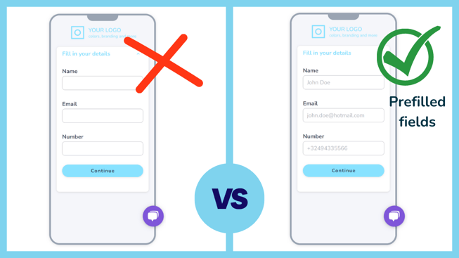
Imagine your prospects encountering a form that already knows them—where their first name and email address are pre-filled, creating an instant sense of trust and familiarity.
Pre-filling data in your form can significantly boost engagement. In fact, we've observed conversion rates increase by over 500% when information is already filled in for the user.
But why does pre-filled data work so effectively? Firstly, it establishes trust. Customers feel secure in an environment that recognizes them.
Create a personalized experience for your prospects by pre-filling their information in the form. Instead of presenting blank fields for their name and email address, greet them by their first name and have those fields already filled in. This simple gesture establishes trust and familiarity, making them more likely to engage with your form.
Secondly, individuals are motivated to actively participate in the form. They may perceive that the provided data is accurate and, therefore, believe that it won't take much time to verify the information. Alternatively, if they notice any incorrect information, the human brain is naturally inclined to correct it, further stimulating engagement.
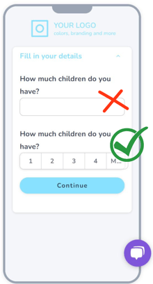
2. Opt for radio buttons and checkboxes instead of free text questions
With over 60% of forms being completed on smartphones, it's crucial to minimize the need for users to type extensively.
Given that users could be multitasking, shifting between completing your form and browsing platforms like YouTube or TikTok,
it's essential to recognize the decline in attention spans and the increasing preference for convenience.
As a result, it's vital to reduce the cognitive load of form filling. Instead of expecting users to generate their own responses, consider providing predefined options that can be easily selected.
3. Moving beyond yes-or-no choices
-1.png?width=220&height=413&name=Ontwerp%20zonder%20titel%20(1)-1.png)
When completing forms, certain users tend to skim through the responses rather than fully reading the question. If you present a simple yes or no option, they will be required to read the question, resulting in an increased cognitive load.
Furthermore, including options that distinctly outline the available choices and their potential outcomes can assist in clarifying the decision-making process for users.
4. Integrate stress-reducing alternatives
Form completion can trigger stress, especially in industries like finance, law, and healthcare, where each response might carry a significant commitment. In some instances, users have encountered difficulties with specific questions, leading them to seek assistance from advisors through email or phone, and, in extreme cases, even abandoning the digital platform altogether.
5. Provide context and leverage the power of intelligent forms-1.png?width=220&height=402&name=Ontwerp%20zonder%20titel%20(2)-1.png)
If you're looking to collect extensive information from your customers, using intelligent forms is essential.
Nowadays, people are cautious about the amount of information they disclose online or to a provider, so it's crucial for it to feel genuine and legitimate.
Naturally, it's important to ask a concise initial question that can reveal a wealth of related information, instead of bombarding users with a long list of individual questions. For instance, you could ask something like, "Have you had any recurring illnesses that required regular consultations in the past 3 years?" This approach saves time and effort for both the user and the form filler.
We discovered that asking users for permission before requesting less essential information was incredibly effective. In order to do this, it's important to provide context to the users, explaining why you need this information and how it will benefit them.
6. Make all questions easily accessible from the start
If you find yourself needing to gather a significant amount of information (more than 8 data points), it's best to avoid a typeform-like user experience. Based on our research findings, users tend to evaluate the remaining number of questions they need to answer. This evaluation often occurs after they've completed the sixth question or encountered a query demanding further research, like determining the net revenue from the previous year.
At this point, users will evaluate the remaining questions and sections that require their attention, making a decision on whether to continue answering immediately or postpone it for later. It is essential to implement a solution that provides real-time saving of their answers to ensure a smooth and efficient user experience.
7. Eliminate the use of progress bars for lengthy forms
Having a progress bar on lengthy forms is not recommended. The main reason is that if you're using intelligent forms, the progress bar will actually decrease in size when a new question or section is added, which goes against your desired outcome.
Another reason to avoid using progress bars on lengthy forms is that the slow progress can be frustrating and doesn't create a satisfying experience. Instead, opt for user interfaces that allow your users to see all the sections they need to answer, along with their status (ongoing, errors, completed) for each section.
Bonus: lengthy forms actually do convert better
This is the most surprising tip that we discovered. In multiple instances, we transitioned from using basic forms (with just contact details and a few details about the request) to longer forms. And surprisingly, we observed a significant increase in the completion rate.
We attribute this to the fact that users prefer to complete the entire process in one go. When presented with forms that are too short, users anticipate being contacted later via email or phone for additional information. As a result, they opt to directly communicate through email or phone channels.
We have built hundreds of forms collecting 30-120 data points with completion rates as high as 80%. These tips will assist you in keeping your users engaged in your process and ensuring that they complete it digitally.
Transform your forms
In conclusion, follow these expert tips to optimize form completion rates and unlock your data collection's true potential. Embrace pre-filling data, use radio buttons and check boxes, provide context, and avoid simple options. Keep your forms seamless and stress-free. The bonus tip? Longer forms surprisingly lead to higher completion rates. Achieve success with completion rates up to 80%.
